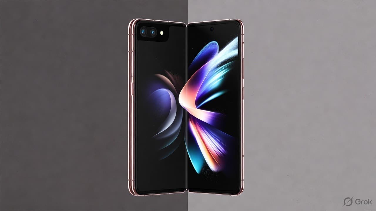
Foldable phones are moving from niche to mainstream, and with Apple's first foldable widely reported (rumoured names include iPhone Ultra or iPhone Ultra Fold), your website will increasingly be viewed on screens that change shape mid-visit. Reports describe a book-style device with a roughly 5.5-inch cover screen and a 7.8-inch inner display close to a 4:3 aspect ratio, priced around or above $2,000. Treat the specifics as reported rather than confirmed. Either way, Samsung, Google, OnePlus and others already sell foldables, so this is a design problem today, not later.
What changes when a screen folds
- Two very different sizes on one device: a narrow cover screen, then a near-square tablet-like screen when unfolded.
- Resizing mid-session: users unfold to see more, and your layout has to adapt without losing their place.
- Unusual aspect ratios: a near-4:3 inner screen breaks layouts that assume "phone = tall, tablet = wide".
What to check on your website
- Layouts based on width, not device type. Never detect "phone vs tablet". Respond to the actual available width.
- Container queries for components. Product cards and grids that adapt to their space work everywhere, including fold screens. (Native CSS guide.)
- State survives resizing. Unfolding shouldn't reset a form, close a modal or jump the scroll position.
- Images use responsive
srcset, so the unfolded screen doesn't get a blurry, phone-sized image. - Tap targets and text stay usable on the narrow cover screen.
- Test both postures in your browser's responsive mode, at narrow and near-square sizes.
Why it matters for e-commerce
Buyers who unfold a phone to browse a catalogue are often your most engaged shoppers. A two-column product grid that looks great unfolded, and a quick checkout that works folded, can lift conversion on a growing slice of premium traffic.
Responsive sites, done properly
At NextGen Fusion, our web development company in Lucknow, we build layouts that respond to space, not device names, so websites work on phones, foldables, tablets and desktops alike.